Kooz's IDLT (Instructional Design and Learning Technology) blog describes the journey of my thoughts as I get my MA in IDLT.

Thursday, October 07, 2010

When Design and the Back End Align

I had a big smile on my face when I realized that the search script is essentially the same as the manual script. The search string goes through each manual database and does a “Full Text” search (each word in a SQL query is indexed minus certain common words), and if there’s a match, then SQL returns the Category ID and ID in an ordered array (by descending relevancy). For each entry returned, it also sees if there’s any photos for that rule. It constructs the php file as such: for each entry, it concatenates (adds on to) two different variables. The first variable is a text string that will become the top level navigation for the search results which are the titles of the rules and a link to the rule. The second variable is the actual rule. After going through all the search entries, the php script essentially prints these two variables out (the top level navigation is an unordered list that has javascript/css applied to it). This was easier than I thought it would be.
The manual is created on the fly just like a search query. It creates one page, but via the iPhone, it looks like separate pages. However, there’s one more level of navigation that the search does not: for the search it goes rule title to rules (and possible pictures). In the manual, it goes chapter to rule title to rules (and possible pictures). The manual script loops through the manual chapters, then through individual rules, and sees if each rule has photos involved. To make three levels of navigation, I needed three variables and three loops to go through all of the entries. Since printing out the variables is essentially printing the html in three sections, the challenge was making sure the end tags were placed in the right spot so that I wouldn’t get formatting errors. The key was to count the number of entries in each chapter and assign that to a variable so that when it got to the last entry, it would add that end list tag. All you have to do is print out ("echo") the three variables, and you have your manual with a hierarchy of linked lists!

Sunday, October 03, 2010

Observations on Learning PHP and MySQL: Venting (but worth it)

I once spent two months troubleshooting one problem: it wasn’t an error that created an explicit error. When a user signs up for the site, the user enters a password then that password is encrypted (using MD5 encryption) and that 64 letter encrypted password is then saved to the data base. After writing the sign up script (based off of Larry Ullman’s script in the book I'm using "PHP6 and MySQL"), Larry’s text directed me to write a "change user information" script. Keep in mind, this is before they could log in. The change user information script required the user to type in a password which is encrypted then matched to the stored encrypted password so that any updates can go forward. Unfortunately, none of my fictional users were able to change their information because they were getting a “Username and Password Don’t Match” error. I combed through the code many times. I re-wrote the code that matched the entered and saved passwords both trying new ways to match the password and just re-writing the code. Fortunately, one day, I was looking over my database and noticed the encrypted values for the user passwords were the same. Every user had a different password which meant that every encrypted password *should* look different from each other. I looked at the user sign in script and found the cause. A rogue “.” was placed in the encryption function md5(.$variable) instead of $variable. The “.” concatenates what’s before the period to the variable. Apparently, that’s enough to make the function go “Ok, this password is X” regardless of what $variable is.

Designing a Database

Designing the databases is a challenge and an appropriate challenge for anyone designing learning because it forces the instructional designer to organize information so that it’s as granular as possible. There are several considerations: what is the information on hand, who will access the information, and how will the information evolve. By designing the database for the users, you need to figure out what information FIRST would find relevant but also it forces you to think about the users as active agents: if you were using this program, what information would you want access to and how would you want information entered treated?

Friday, October 01, 2010

Interface Design: Part 5


The quiz: Only logged in users will be able to take the quiz, and I'll need to design for this event. The quiz itself will need to be introduced, and questions will have two types of presentations: text and text with picture. I'm imagining this with a vertical orientation because it features multiple choice questions, and it affords reading the possible answers as they would they're arranged in a vertical list.


Interface Design: Part 4


The learning module. How do I deal limited real estate and do an effective presentation of the learning material? If I do a landscape mode, then it would afford pictures that have a normal height/width ratio. Plus, as I've used webpages in the past on an iPhone, it's easier to mix pictures with text. I'm up in the air about this. Orientation is an important consideration when designing for iPhones.

Thursday, September 30, 2010

Interface Design: Part 3


Coming in on the tail of the search interface, the manual won't be too different. It's basically a list of sections that segway into specific rules. Handling pictures will be a challenge throughout this project.

Interface Design: Part 2


Designing the landing "Home" page and the search interface. I'm not sure about having the search and the manual behind a login firewall. If this is about "information on the fly" then a login should not be needed to use them.


Wednesday, September 22, 2010

Interface Design: Part 1


The fun part!! I'm trying to deal with limited real estate, but it's that difficult due to my extensive experience with iPhone apps in general.


Intro Screen, login, and the registration screens. These are straighforward. The user should be presented with FLL's branding, plus they'll need to either log in or register.


Friday, September 10, 2010

Learners

Just some thoughts on the learners. There are three main demographics for the this learning: from my experience FLL (and FIRST in general) attracts professionals, college students, and retirees. All of these groups come from a workplace or home environment that is science and/or technology related. Not all are engineers or scientists, but more than likely, they work with, live with, or want to be an engineer or scientist. This is a great demographic for an iPhone application solution: it's tech friendly, portable, and very user friendly. For the professionals, studying FLL rules in their spare time is facilitated by having a portable app. Also a note on gender: FLL volunteers in general are pretty evenly divided, but referees tend towards male (60-70% based on my observations).

Learners:
A. Professionals
i. Limited time
ii. Highly capable
iii. Needs to work well with children
iv. Variable tech savvy (usually above average)
v. Variable FIRST experience

B. College Students
i. Very tech savvy
ii. Time to spare
iii. Needs to work well with children
iv. Variable FIRST experience

C. Retirees (more likely to be engineers)
i. Variable tech savvy (higher than what one would expect of most retirees, but lower than the professionals)
ii. Time to spare
iii. Needs to work well with children
iv. Variable first experience

Tuesday, September 07, 2010

Proposal to Create a Smartphone App for FIRST Lego League

Needs: FIRST Robotics is an organization “For Inspiration in Robotics Science and Technology” that conducts robotics competitions for many age ranges in order to spark interest in science and engineering. For this project, I will be focused on the FIRST Lego League (FLL). FLL, a league for kids grades 4-8, challenges them to design, build, and program an autonomous Lego Mindstorms Robot in order to complete several challenges/missions on a plywood sized field. Every year, there is a new theme, new challenges/missions, and significant changes in the rules. As such, there is a demand for qualified volunteers, a need for training, and a desire for on demand information (when not sure of a rule, look it up!). As a FIRST volunteer who travels a lot, having access to information in a small form factor is important. Additionally, it’s nice to have the rules in my pocket at the competition instead of a binder!

As someone who is deeply involved in FIRST Robotics in the role as a referee, it is imperative that I understand FIRST’s commitment to “gracious professionalism.” It’s first and foremost a commitment to the youth in the program and to the other volunteers who participate in creating interest in science and engineering. As a referee, it is my duty to make sure the game is played in a fair, timely, and professional manner. In order to fulfill my duties as a referee as such, FIRST expects its referees to understand the principles with which it was founded, and mostly, know the field setup, game concepts, and of course, the game rules. I could not claim to be a gracious professional, and it would be a disservice to the kids and the other volunteers if I did have a holistic understanding of these.

Learning Goal:

Learners will learn the basic principles of FIRST, the game manual, game logistics, and appropriate adult/youth interaction during the game. They will:

a. Be able to demonstrate a firm understanding of the rules including: field setup, game concepts, and game rules/scoring.

b. Understand and appreciate how FIRST wants you to interact with kids

c. Be able to demonstrate an understanding of event logistics.

Performance Goals:

a. Learners will be able to look up rules on the fly through a manual look up or through a manual search.

With these requirements in mind, I propose to create an iPhone web application that will address a referee’s need for portable information, it will deliver referee training, and it will measure their understanding by quizzing them. Since the content changes yearly, I also propose to create a “backend” for the app that is updateable and tracks learners success with the quiz; I plan to do this by learning to program in php.

Monday, November 19, 2007

Rendleman Math

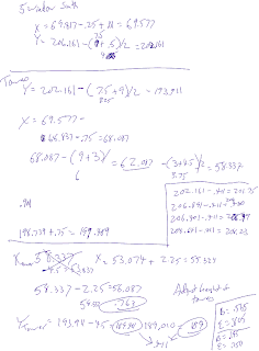
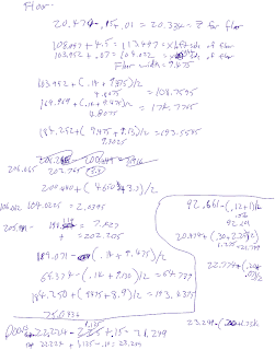
In order to do Rendleman justice, I needed to make sure it's proportions were correct and measure things out a bit. On my second survey, I wanted to test my theories, but silly me, I forgot any sort of measuring tool. No fear! I used my trusty iPhone, and used that to make crude measurements. I wasn't going for exactness, but correct proportions. However, I think I came pretty darn close to rendering it exactly. The first and second pages of notes reflect this.

Secondly, I needed to build it in world. What helped me most were several video tutorials (YouTube - Second Life Tutorial - How to use the building grid and YouTube - Noob Be Gone - Second Life Building Tutorial by NSS) and a web page by Bob Sutor. His blog, Striking the Right Chord, did just that! He had a simple equation that determined the Y or X or Z of an object if you wanted to position it next to another so that they abutted. Instead of using the in world grid (which helped a little), his equation helped immensely, and I adapted it to situations where two objects needed to be placed parallel, perpendicular, etc. the equation is:

Xobject2 = Xobject1 +/- (Width object1 + Width object2)/2.

Throughout my notes, you'll see me use this extensively. Basically, it's the sum of the width of the two objects divided in half. You then add or subtract (if you look at the prim positioning arrow, if your new object is placed away from the arrow, you subtract, and with the arrow, you add) the position of the original object. After positioning several prims, the "copy" magic wand selection helped out immensely (I got that from the second video tutorial above) because it automatically positioned linked prims along the axis you wanted to create the copy.
Well, with much ado, here's my notes.

Rendleman Math (Cont'd)


Rendleman Math (Cont'd)


Rendleman Math (Cont'd)


Last RL and SL Comparison Pictures.


These views are a bit better....I think I nailed the proportions down pretty well. There were a couple of things I missed when I first surveyed Rendleman, but caught them the second time. For example, I thought the width of the front, center facade was 22 RU's when it was actually 23 (two half windows). Same thing with the third floor interior front windows. There were 9.5RU's and not 9 RU's.


Posted by Picasa

Finish Model with Real Life Rendleman


Not bad, eh?


Posted by Picasa

Wednesday, November 14, 2007

More Progress


Second Life Vs. Real Life

It's getting closer!!
Posted by Picasa

Monday, November 12, 2007

In World Progress


Well, as you can see, I'm making good in world progress. I've finished the South East Corner (South West in Real Life) of Rendleman Hall! It looks pretty darn close to the real thing!
Posted by Picasa

Wednesday, November 07, 2007

I've started my assault on rendering Rendleman...

Practicing and testing out my proportion theories have worked very well in sketch-up. Creating a rough draft in SL has been relatively easy. Here is a picture of Rendleman in RL then SL...

Final Sketchups Before Building It in SL

The back of Rendleman...The front left...
The rear, left side near the student center...
Another view of the front...

Well, it's going to be very hard to work within the 10x10 limitations SL has...well, I think the componets (the windows, etc) will be easy, but making sure it's all on the same level will be a challenge....

Thursday, October 25, 2007

The Symetry of Rendleman

One thing that's going to make Rendleman easier to render in 3D is its symmetrical design. The windows are going to be my unit of measurement because they're uniform. For example, the front of the building has three sections: the east wing has 18 windows, the west has 12, and the middle has 22. The facade has 12 large windows, but they're actually, twice the width of the normal windows, and the windows on the far left and right are actually 1 Rendleman window unit wide. This seemingly even number of windows is actually an odd number (11 large windows), but in order to place the doors in the middle in a symmetrical fashion, they split the 11th large window into two.
Additionally, we can deduce that the doors' width are two-thirds an RWU, and from the pictures, they're uniform around the building. The door height is equal to the height of the window above them, but the top row of the large windows have a different height: the same height as an RWU. Also observe that these large windows are squares, so 2 times the RWU width equals its height. I could be wrong about this seeing how if each RWU employs the Golden Rectangle (the ratio of height and width would equal 1.618:1), then each "square" would have a width of 2 RWU and a height of 1.68 RWU. But I just don't see that the height is .32 units shorter than the width: You would need three window widths to nearly equal the height if the Golden Rectangle was used (3:3.236). It makes sense architecturally/aesthetically to employ the Golden Rectangle (and the largest windows in the front may just be Golden Rectangles). But it doesn't work...the scheme of this building seem to be of 1:2 and not 1:1.68.
Style: I need my brain to cool down after that last bit. So, I'll make a note on style. Luckily, I'm familiar with Frank Lloyd Wright, and I can't help but see his Praire Style utilized in this building. Horizontal lines are emphasized over the vertical lines giving it a closer to the ground look: it basically matches the flat field in front of it. Although the materials are much more utilitarian and minimalistic than an earthier Wright building. Neo-Praire style?

Wednesday, October 17, 2007

The Challenge of Rendering Rendleman Hall

Yikes, has this been a challenge seeing how a) my car broke down b) there are very few decent pictures of Rendleman if you google it, c) I've been working late to get to get ready for the new Bodyworlds 3 exhibit at the Science Center (well, it's a convergence of projects). And so, like today, there wasn't enough light out when I left work. But, I do have enough to get something done.

I need to figure a couple things out:
a) I'm thinking that tonight, I'm going to do a rough sketch of Rendleman Hall in Google Sketch-Up (unfortunately, you can't import Sketch-Ups in to SL). But, this will give me a reference in which to work from. I should be getting a second monitor soon so that I can have both SL and Sketch-Up open at the same time (or at least jpg's of my sketches).
b) Scale is an issue as it relates to visual proportions. I don't need to get Rendleman Hall down to the last inch, but the idea is for SIUE SL users to visually get "it." Making sure I get the textures and look are important. At the same time, I want to make sure it's roomy enough for when people add things to it....
c) Rendleman Hall in SL will basically be an empty shell. (A thought just occurred to me, how far can you dig down in SL? It would be great to be able to do more with that space than within the traditional dimensions of the real life Rendleman Hall....) I want to make sure it's high enough and that the doors work (just something I want). I think the entrance is going to be the big challenge with it's transparent textures, geometry, and most of all, it's the most visually recognizable part of the building.

Update: 12:45 AM Here are the sketchups of Rendleman....not bad, seeing how I used a campus map pdf file that showed the outline of the building and three lo-res (200x100 at best) pictures:


Wednesday, October 10, 2007

Second-Life and Getting Acclamated

I've been toiling around Second-Life for the last three weeks (although I've visited SL several times over the last year on whims), and I'm very disoriented. It's not hard to get around. I walk, fly, or teleport to new places. If I need help, there are friendly people who will give me a hand (and I've had encounters with some people who wanted to get too friendly...). I don't think the graphics are great, but they're not bad either. But, I'm still feeling out of sorts, and I think I know why: my other experiences with MMRPGs'.

The biggest MMRPG I played was Star Wars Galaxies, and as far as MMRPGs go, it had a relatively high learning curve (this was before it was dumbed down after the new combat system was introduced and apparently, it was dumbed down even more with fewer character classes, but I digress). However, there were several control differences with SWG: the mouse had more character control than in SL. In SL, you have a mouse cursor and your character kinda follows it. In SWG, the mouse could really whip you point of view around. Oh, and flying wasn't much of an option either (I need to remap the flying keys in SL so that they make more sense).

The control scheme of SL is minor compared to its lack of spatial and experiential organization. True, SL's chaos can be a good thing because it's entirely user driven. There are some truly unique and far out environments in SL. In SWG, on the other hand, the worlds made sense in terms of city and planet layout (SWG had mutliple planets: Tatooine, FTW!). Cities were organized in such a way so that you could follow visual way points to a destination (from signs to roads to a really good HUD map system). Granted, SWG made sense to those who were fans of Star Wars, too. In SL, you're lucky if a square kilometer or even little plot of land has some sort of visual or organizational continuity (there are some, but not many). Plus, in SWG, your experience had some organization to it: were you an Alliance or Imperial supporter? What class was your character? How do you level up your character? This is missing from SL for good reason: it's the ultimate digital sandbox. I find it disorienting, but give me time, and I'll figure it out.